Read through the blog here, or skip to Jason’s July 2024 Market Update video below.
The economy has appeared to defy the odds lately in response to elevated inflation and the Federal Reserve’s tightening of markets. At times, the Fed will try to slow the economy to combat inflation by raising interest rates and vice versa to stimulate the economy. So far, markets have remained rather resilient despite the tightening nature of high interest rates.
Stock Markets Are Up for the Year
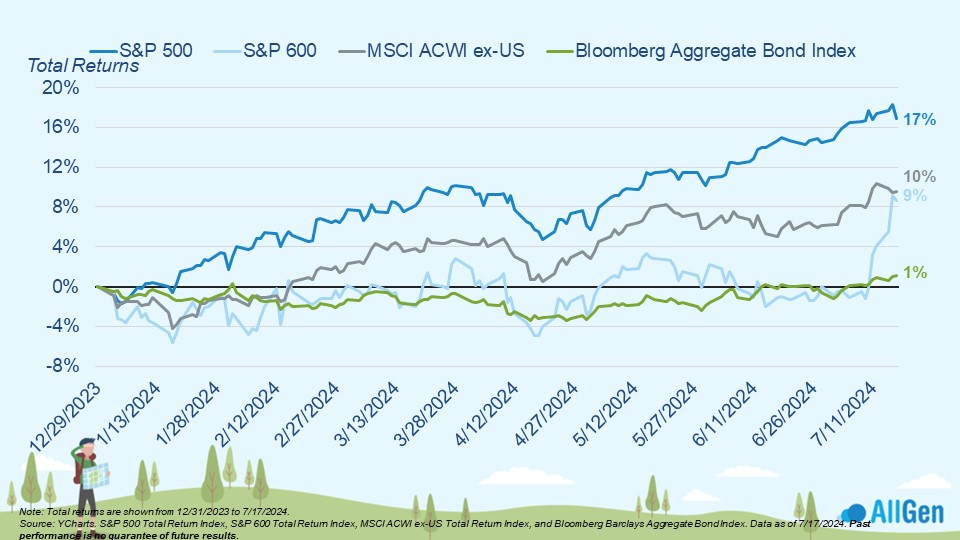
The S&P 500 leads other broad market indexes, up 17% for the year as of 7/17/2024, followed by international stocks at 10% and bonds, which inched up 1%. Small-cap stocks are up 9% over the same period but have spent most of the year flat until recently.
The Magnificent 7 Stocks Plus the Rest
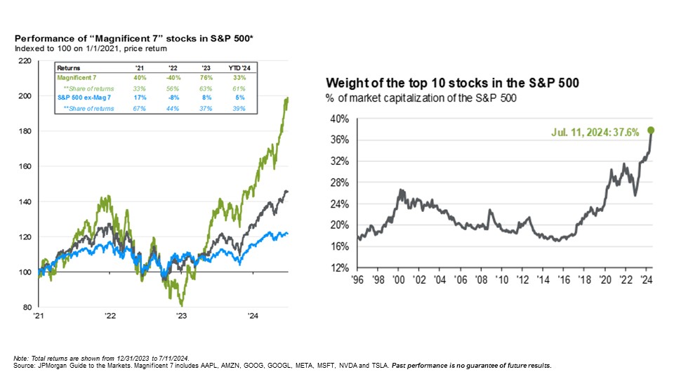
Investors frequently use the term “Mag 7,” which is short for the Magnificent Seven. These seven stocks are commonly recognized for their market dominance and include Alphabet, Amazon, Apple, Meta, Microsoft, NVIDIA, and Tesla. In the chart below, notice how the returns of the Mag-7 stocks (the green line) are much larger than the S&P 500 index as a whole. They have historically outperformed the index in rising markets but underperformed the index in falling markets. Some of these companies have even reached market cap levels in the trillions, which gives them a significant portion of broader indexes like the S&P 500. Just eight years ago in 2016, the top 10 stocks in the S&P 500 represented about 17% of the index, whereas today they represent nearly 40%.
S&P 500 Growth Attributed to Magnificent 7 Stocks
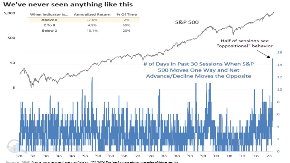
To further examine the fact that a large weighting of the S&P 500 is allocated to only a few stocks, we also like to research the advance/decline. The advance/decline measures market breadth that tallies the number of stocks moving up vs. the number of stocks moving down. A strong market would mean that the S&P 500 as a whole is moving higher along with a rising advance/decline. A declining advance/decline along with a rising S&P 500 would mean that only a few stocks in the index are contributing to its rise: an indicator of market weakness. We’re currently in the largest stretch where these metrics have been moving in opposite directions, further indicating that the S&P 500 has only a small number of stocks to thank for its solid performance. Historically, when these two metrics diverge, returns have been sluggish. This weakness is something we’ve been monitoring heavily over the last few months.
Technology and Communication Stocks Are Leading
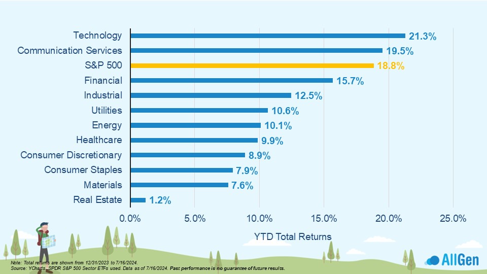
Focusing on sector performance, technology, and communication services are leading the way and are up 21.3% and 19.5% respectively for the year. This happens to be where the Mag-7 stocks live. Notice how the S&P 500 index in yellow, which represents the whole, closely resembles the returns of these top sectors whereas the rest of the index is falling behind.
Smaller Companies Have Better Stock Valuations
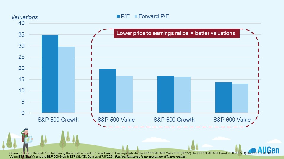
Given the S&P 500’s recent outperformance among stock indexes, we’re seeing valuations become extended in relation to smaller-sized companies. In the chart below we look at the price-to-earnings (P/E) ratio, which divides the share price by the company’s earnings per share, where we can clearly see that smaller companies are trading at better valuations; the lower the P/E ratio the better the valuation. Forward P/E indicates price in relation to forecasted earnings, which also look strong for smaller companies when compared to large-cap companies.
Overbought Markets Have Led to Subpar Near-Term Returns
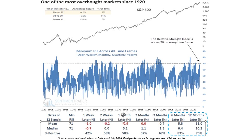
The relative strength index (RSI) measures market momentum and can be used to analyze market directions. Across all time frames, we’ve plotted the RSI of the S&P 500, which is currently above a reading of 70. In this model below, you can see that since the 1920s, we’ve only seen these levels of RSI in the S&P 500 1% of the time, which has historically led to lower near-term returns. At these levels, market analysts sometimes refer to markets as overbought. Historically, when the RSI reaches 70 or higher, six and twelve months later, the index produces decent returns (blue dotted area).
Growth Stocks vs. Value Stocks
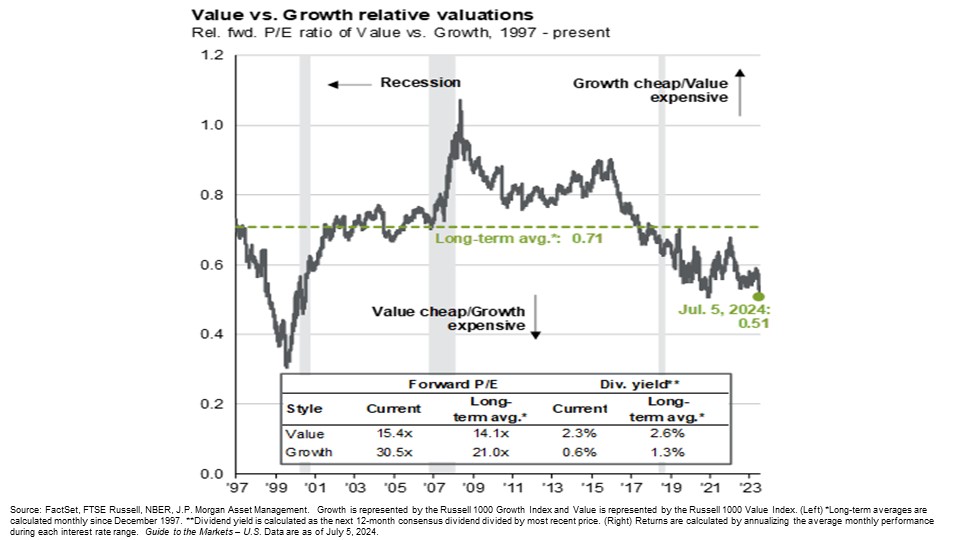
Diversified portfolios will typically include, among others, a balance of growth stocks (fast-growing, risky, high-priced relative to earnings, and typically technology-based) and value stocks (steady growth, established businesses, and low-priced relative to earnings and other valuation metrics). The chart below plots the relationships in P/E ratios where a reading above the dotted green line would indicate growth stocks are cheap and a reading below would mean value stocks are cheap. Since 2017, value stocks have had better valuations according to their historical average.
Small Cap Stocks Outperform Largely Due to Expected Interest Rate Cuts
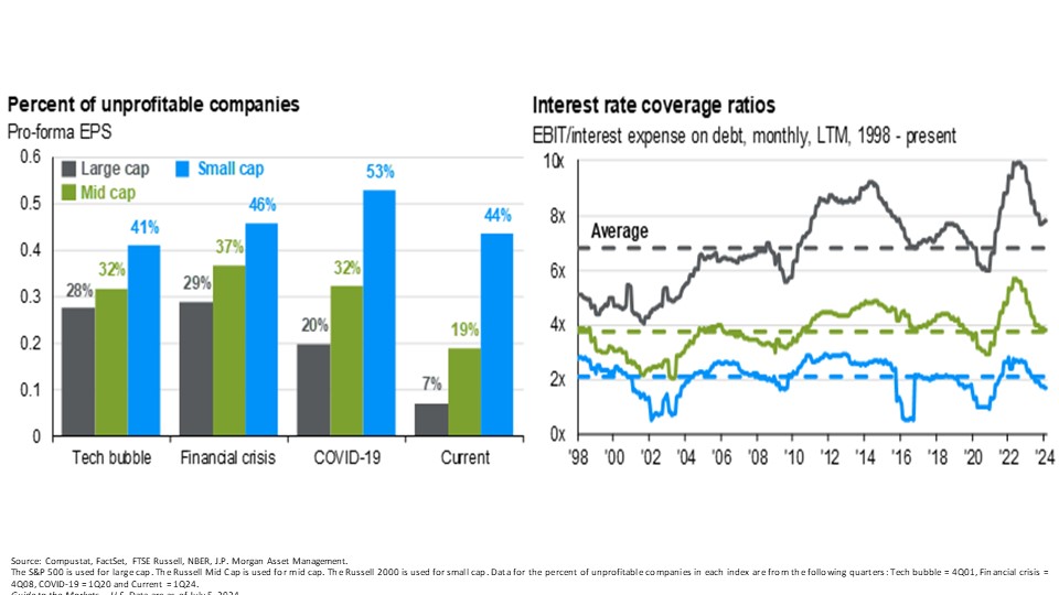
We’ve talked heavily about the S&P 500, which represents 500 of the top US large-cap companies, and believe that well-diversified portfolios should also include small and medium-sized companies. There are important characteristics to note when analyzing smaller cap companies: a larger percentage of them are unprofitable and much more sensitive to interest rates. Seen below on the left, we analyze recessionary periods and the profitability of each segment (small, medium, and large), noting the percentage of unprofitable companies that exist in each. Notice that in every recession since 2000, smaller companies struggle the most.
Similarly, on the right, we plot interest coverage ratios for small, medium, and large companies since 1998, which is a measure of how well a company can service its debt. We find that smaller companies have a harder time maintaining healthy interest coverage ratios. The higher the interest coverage ratio the healthier the balance sheet. When interest rates are high, they put the most financial pressure on companies with weaker interest coverage ratios and vice versa, meaning that if interest rates come down soon, smaller size companies may find the most relief. Small caps have significantly outperformed in recent weeks in anticipation of interest rate cuts this year.
Rising Interest Rates Correlate to a Stronger U.S. Dollar
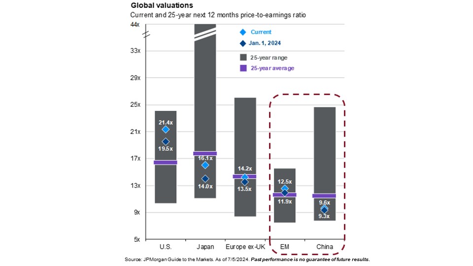
US markets have no doubt dominated global markets in recent history; however, the U.S. hasn’t always outperformed. Starting with valuations and examining 25-year historical ranges and averages of stocks in the U.S., Japan, Europe, emerging markets, and China, we can see that the US is the only market currently priced well above historical valuations. The blue diamond inside each bar below indicates where valuations are currently in relation to their 25-year average (the purple bar). If the blue diamond is below the purple bar, it would indicate investments are historically cheap.
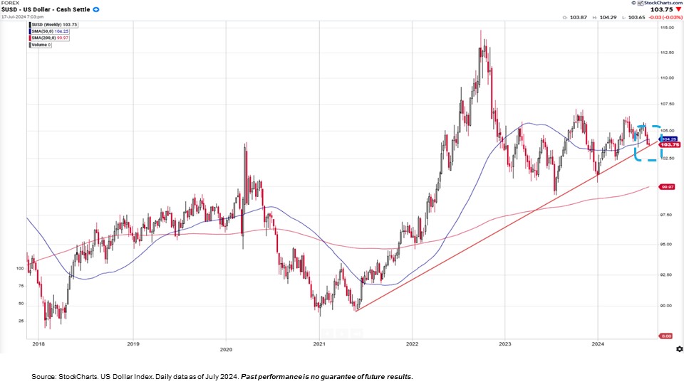
The value of the dollar has gradually strengthened since 2021, which might be confusing given that inflation was also rising around the same time. The dollar’s strength in relation to other global currencies remained strong as interest rates rose; rising interest rates typically correlate to a strengthening dollar. Technically speaking, the dollar is testing support, meaning we might be at a turning point in the strength of the dollar.
Gold Tends To Be Negatively Correlated to the U.S. Dollar
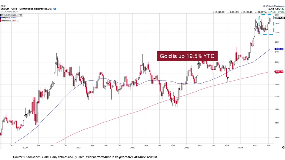
Gold’s relationship to the strength of the dollar is typically negatively correlated, meaning that when the dollar weakens, the price of gold tends to rise. Gold has reached all-time highs as of late. If the dollar continues to weaken, gold may continue to rise, which is something we’re closely monitoring.
Inflation Rates Remain Elevated
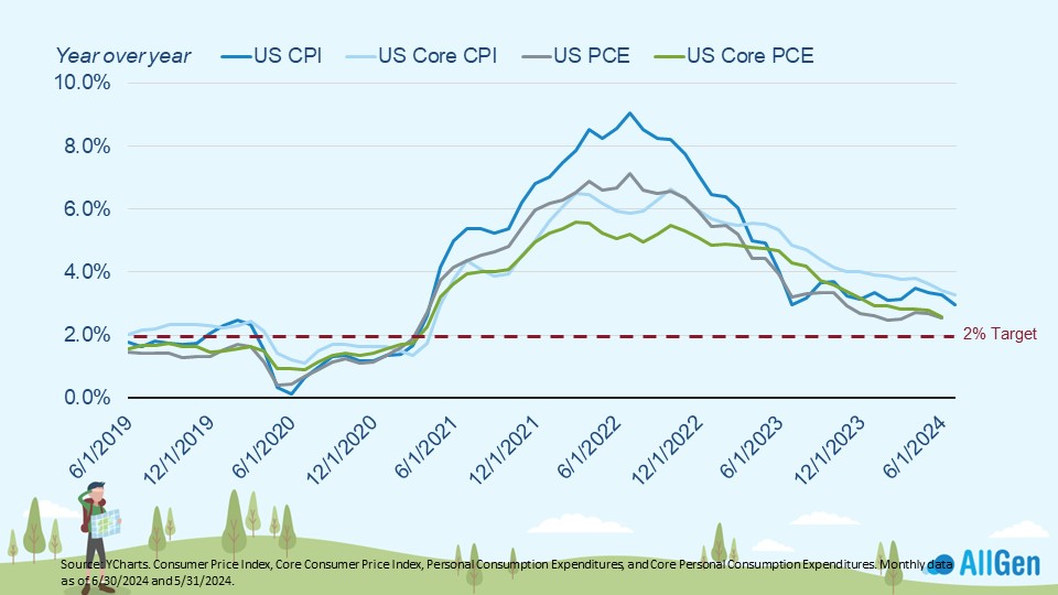
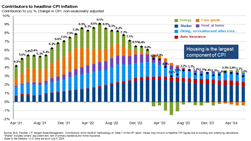
Inflation has spent much of the last 2 years coming down from its high of nearly 9%. The Fed targets 2% inflation but U.S. inflation, as measured by the U.S. Consumer Price Index (CPI) remains above 2%. Jerome Powell, the chairman of the Federal Reserve, has signaled that the Fed won’t be waiting for inflation to reach the 2% target before lowering interest rates, largely due to the lagged nature of inflation data.
Further drilling down on inflation components, we break down each component of inflation to view each one’s overall contribution to rising prices. Shelter, the dark blue bar, although known as the stickier form of inflation, has gradually been slowing, which should help inflation continue to fall as it remains the largest contributor to elevated inflation.
How Wage Growth Affects Inflation
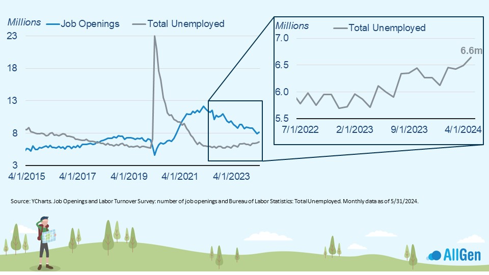
Another component of inflation that drives prices not depicted in the above chart is wage growth. Elevated wage growth also tends to keep inflation elevated, which typically comes from a strong job market that has remained resilient for longer than expected. When analyzing the number of job openings with the total unemployed (people looking for work), we can see that we just went from a shortage of 2.3 million workers to a shortage of 1.5 million workers, meaning that the gap is closing.
The economy is short 1.5 million workers, down from 2.3 million
PMI Indicates Economic Slowing
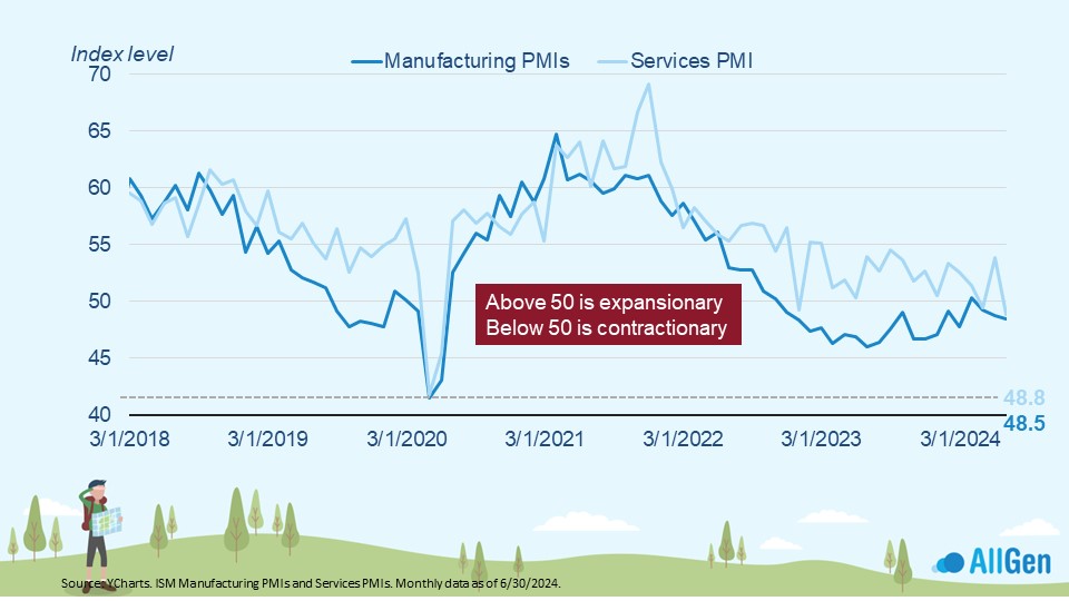
The economy has also remained resilient for longer than expected but is beginning to show signs of weakening. The Manufacturing Purchasing Managers Index surveyed supply chain managers across many industries to create an index. The below chart illustrates manufacturing and services PMI and whether it’s expansionary (above 50) or contractionary (below 50). We can see that the economy is slowing based on recent readings below 50.
Interest Rates Remain High To Fight Inflation
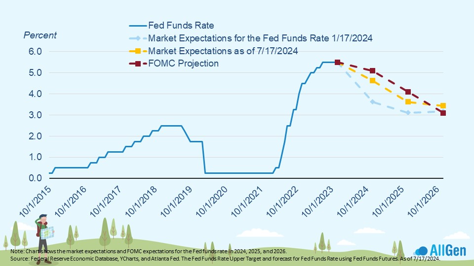
The Federal Reserve has been trying to reduce inflation by raising interest rates and reducing the money supply. 2022 was one of the most aggressive rate hike cycles in history and many thought interest rates would be lower by now. Yet, the economy has remained strong. At the beginning of the year (the blue dotted line) the market predicted that interest rates would be lower and, as of last week (July 17th), these expectations rose. Both are still below FOMC projections, indicating that the market has remained strong for longer than expected giving the Fed more time to keep rates elevated to fight inflation. Interest rates have remained at current levels for nearly a year; much longer than analysts expected.
Returns are generally positive after some of its worst pullbacks
Bond Prices May Rise
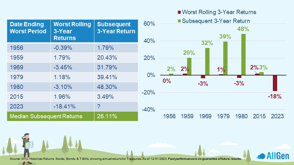
We’ve mentioned before that the bond market has gone through its worst market cycle on record. Bond prices move inversely to interest rates, meaning that when interest rates rise, bond prices tend to fall and vice versa. Going through one of the most aggressive rate hike cycles in history caused bonds to struggle. In the chart below, we’ve analyzed the worst 3-year period for bonds and the subsequent 3-year period. Bonds have historically recovered and returned 26% on average over the next 3 years. Although historical performance is no guarantee of future performance, it’s worth noting that interest rates are also elevated with short-term treasuries paying close to 5%.
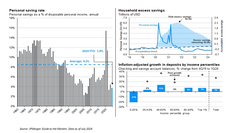
Consumer Savings and its Relation to Economic Health
The health of the consumer can help provide insight into the health of the economy. In the graph on the left of the chart below, we measure the percentage of a person’s income dedicated to savings since 1960. Currently, consumers are saving nearly 4% of their income, which is significantly below the long-term average of 8.5%. The chart on the upper right measures the consumer’s excess savings, which is continuing to dwindle as the shaded blue area declines. As excess savings approaches zero, consumers will either have to cut spending or take on additional debt, further weakening consumer health.
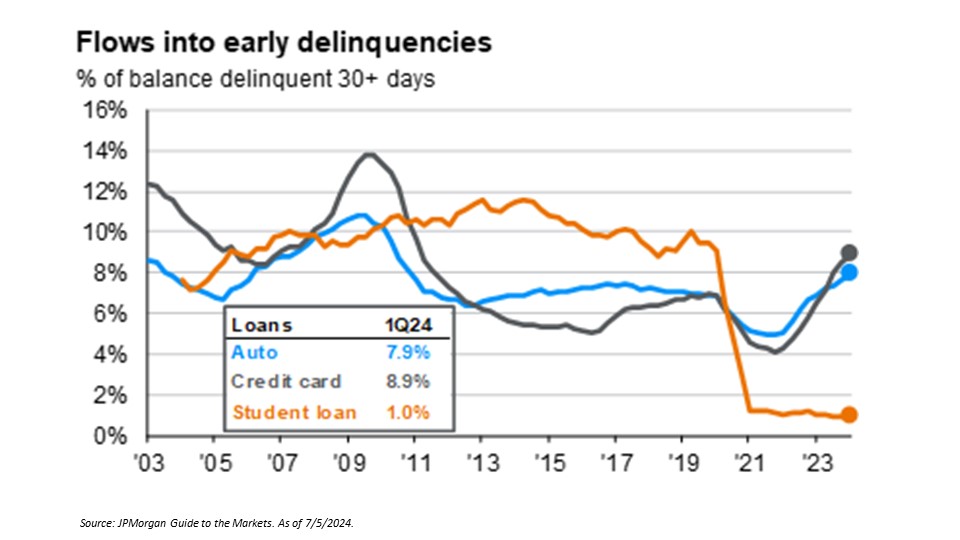
We’ve been closely tracking consumer delinquencies for car loans and credit cards, which are on the rise and currently at levels not seen in the last 15 years, further suggesting the health of the consumer is weakening.
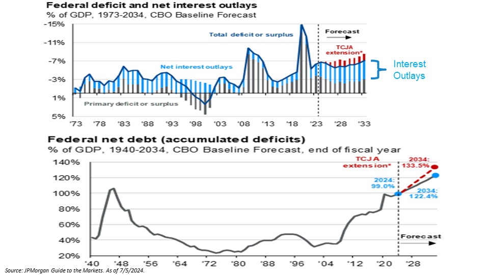
National Debt and Deficits Forecasted To Increase
The U.S. is currently running a very high deficit. With interest rates elevated, the U.S. now needs to use a significant portion of the budget just to pay interest on its debt, which is forecasted to increase (the light blue bars). In the next chart, when factoring out inflation by taking the Federal deficit as a percentage of GDP, we can see that we are approaching levels not seen since the World War II era.
Keep Politics out of Your Investment Decisions
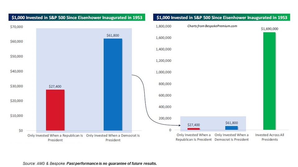
We’re no strangers to the unique political developments we’ve seen as election day in the U.S. approaches. Some individuals might feel inclined to make investment decisions based on certain outcomes of the election. We want to warn clients that the news media will be targeting your emotional connection with your money. Below, we illustrate a compelling argument that you should maintain your investments no matter who is in the White House.
Since President Eisenhower was inaugurated in 1953, we’ve calculated what the S&P 500 has returned if you only invested when a Republican was president vs. when a Democrat was president. If you started with $1,000 you would have $27,000 today if you only invested during Republican presidencies, and $61,000 if you only invested during Democratic presidencies. If you simply remained invested the whole time, your $1,000 investment would be $1,690,000. The power of remaining invested through political noise can offer much better outcomes than taking a political side with your investments.
Contact Your Financial Advisor
A well-diversified, disciplined strategy that manages risk first is what we strive to build for our clients. Contact your advisor to learn more about how AllGen can help manage risk in your portfolio!
For more information, watch the full July 2024 Market Update video below.
Important Disclosures: The information provided here is of a general nature and is not intended to answer any individual’s financial questions. Do not rely on information presented herein to address your individual financial concerns. Your receipt of information from this material does not create a client relationship and the financial privileges inherent therein. If you have a financial question, you should consult an experienced financial advisor. Moreover, the hiring of a financial advisor is an important decision that should not be based solely upon blogs, articles, or advertisements. Before you hire a financial advisor, you should request information about the financial advisor’s qualifications and experiences. Past performance is no guarantee of future results. All expressions of opinion are subject to change without notice in reaction to shifting market conditions. Data contained herein from third party providers is obtained from what are considered reliable sources. However, its accuracy, completeness or reliability cannot be guaranteed. Examples provided are for illustrative (or “informational”) purposes only and not intended to be reflective of results you can expect to achieve. AllGen Financial Advisors, Inc. (AllGen) is an investment advisor registered with the SEC. AllGen does not provide personal financial advice via this material. The purpose of this material is limited to the dissemination of general information regarding the services offered by AllGen. The Disclosure Brochure, Form ADV Part II, which details business practices, services offered, and related fees of AllGen, is available upon request.


