Read through our market commentary here, or skip to Jason’s August 2022 Market Update video below.
Tracking US Inflation
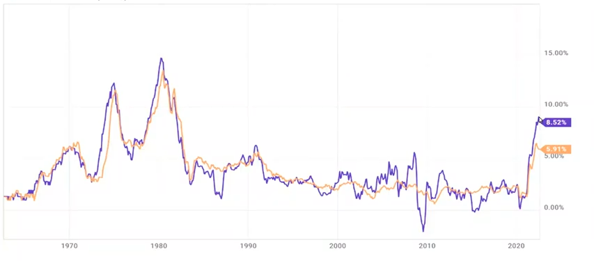
2022 has proved challenging for investors as economies grapple with elevated inflation, aggressive Federal Reserve policies, and two consecutive quarters of negative GDP. Beginning with inflation in the chart below, we track US inflation and core US inflation (excluding sensitive items such as food and energy) from the 1960s. US inflation, over the last 12-month period ending 7/31/2022, has risen to 8.52% and is off it’s previous month high of 9.06%. While it’s still early to call the peak of inflation, there are several commodities like wheat, soybeans and gas prices that seem to be cooling off and could help inflation subside. Other metrics like housing and rents, suggest it could stay elevated for a longer time than expected; housing accounts for 40% of the total CPI inflation index calculation.
Wage Growth Has Increased
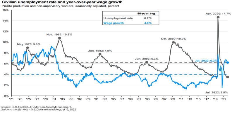
Another metric that can contribute to more inflation is wage growth. In the past year, wage growth has increased above its 50-year average of 4% to over 6% per year and is near its highest level since the early 1980s. Historically, elevated wage growth has contributed to elevated inflation, and as depicted in the chart below during the 1970s, wage growth was consistently bound between 6% and 9% for over a 10-year period. During that same time, inflation remained high ranging between 5% and up to nearly 11%! With high wage growth individuals make more money, which can lead to increased spending, which can lead to higher aggregate demand, which can lead to higher prices (inflation). Additionally, with tight labor markets, companies are finding themselves increasing wages to attract workers.
Fed Rates
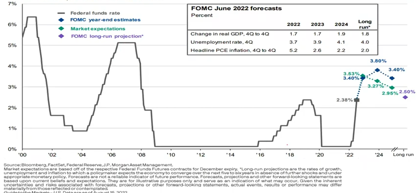
We’ve covered the Federal Reserve’s two main tools to fight inflation in previous blogs: Raising interest rates, and quantitative tightening. lowering interest rates makes it cheaper for individuals and companies to borrow money which allows them to spend more in the economy. This happened in 2020 as the Covid-19 shutdowns were unfolding and the Fed was trying to stimulate the economy. Conversely, raising interest rates increases the cost for individuals and companies to borrow, causing people to borrow less and spend less in the economy, consequently slowing the economy. Currently, the Fed is desperately trying to combat inflation by raising rates aggressively to increase the cost of borrowing which can reduce spending in the economy, which can reduce aggregate demand, which should reduce inflation. The Federal funds target rate is now near 2.25% which is where it was pre 2020 Covid pandemic and is climbing fast, much faster than any other time in the last 22 years.
Quantitative Tightening in Fighting Inflation
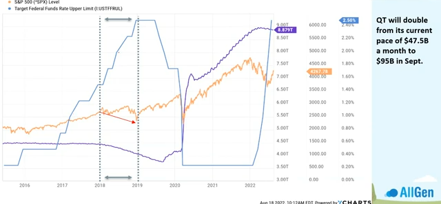
The other tool the Fed can use fight inflation is quantitative tightening which has already begun. This process is the opposite of printing money and reduces the money supply in circulation. Currently the Fed is reducing it’s assets by $47.5 Billion per month and will increase it to $95 Billion in September 2022. This means that the purple line in the chart below will begin to come down at a faster rate. We’ve been in this market environment before from 2018 to 2019 where the Fed was raising interest rates (blue line) and reducing assets at the same time (purple line). Stocks in the S&P 500 (orange line) underperformed. See the Video link at the end of this article where Jason covers this chart in more detail.
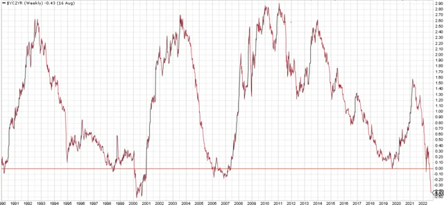
One very important metric investors monitor is the yield curve and when it becomes inverted (negative). Investors typically demand higher interest rates for investing for longer periods of time and receive lower interest rates for shorter periods of time, which would logically indicate a strong economy. If short term rates become higher than long term rates, meaning investors receive a less return for investment their money for longer periods of time, it means that there is weakness in the economy. The spread in yield (yield curve) between the 2-year treasury bond and 10-year treasury bond is now very inverted (below zero), which has historically preceded economic recessions (see bottom right of chart below). The yield curve between the 3-month treasury bond and the 10-year treasury bond is approaching zero at an incredibly fast rate and will likely invert soon.
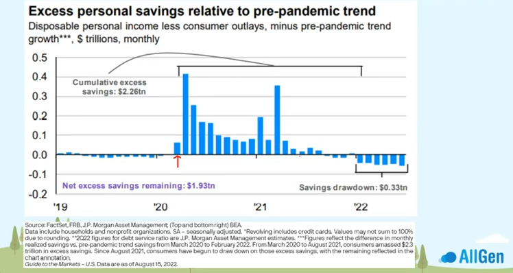
When comparing where we were only two years ago, we came from record amounts of government stimulus and very cheap borrowing costs and then switching to rapid interest rate hikes and quantitative tightening. Throughout 2020, individual savings increased dramatically as stimulus was injected into the economy. beginning in 2022, savings rates are beginning to drawdown (see below chart).
Economic Indicators Suggest a Probable Bear Market
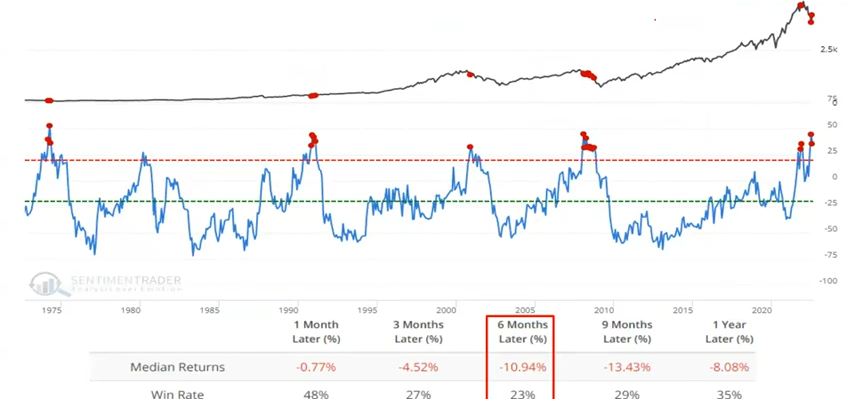
Macroeconomic models are also pointing to a higher probability of a bear market. The indicator below considers the direction of several economic indicators including new home sales, housing starts, building permits, initial unemployment claims along with several more, and combines them into one indicator. When charting this indicator against stock market performance, we can compare how past markets performed when the indicator reached extremes. Seen below, when this indicator reached extreme levels in the past since the 1970s (when blue line reaches above the red dotted line), the S&P 500 struggled to perform and only produced positive returns 23%, 29% and 35% of the time for the respective subsequent 6-month, 9-month and 12-month time periods. Currently the indicator is at an extreme which can offer some guidance that the economy may continue to slow.
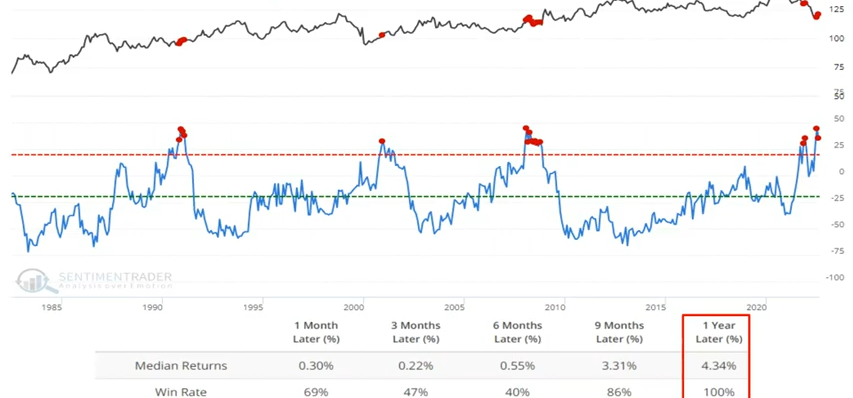
Using the same indicator, however instead of comparing it against the S&P 500, we match it up against 10-year treasury bonds. We can see that returns for bonds were positive 1 year after the indicator entered extreme territory, with a median return of about 4.3%. Even though 4.3% may not seem high, bonds typically hold up better than stocks during market downturns which supports incorporating bonds in a portfolio during times of economic weakness.
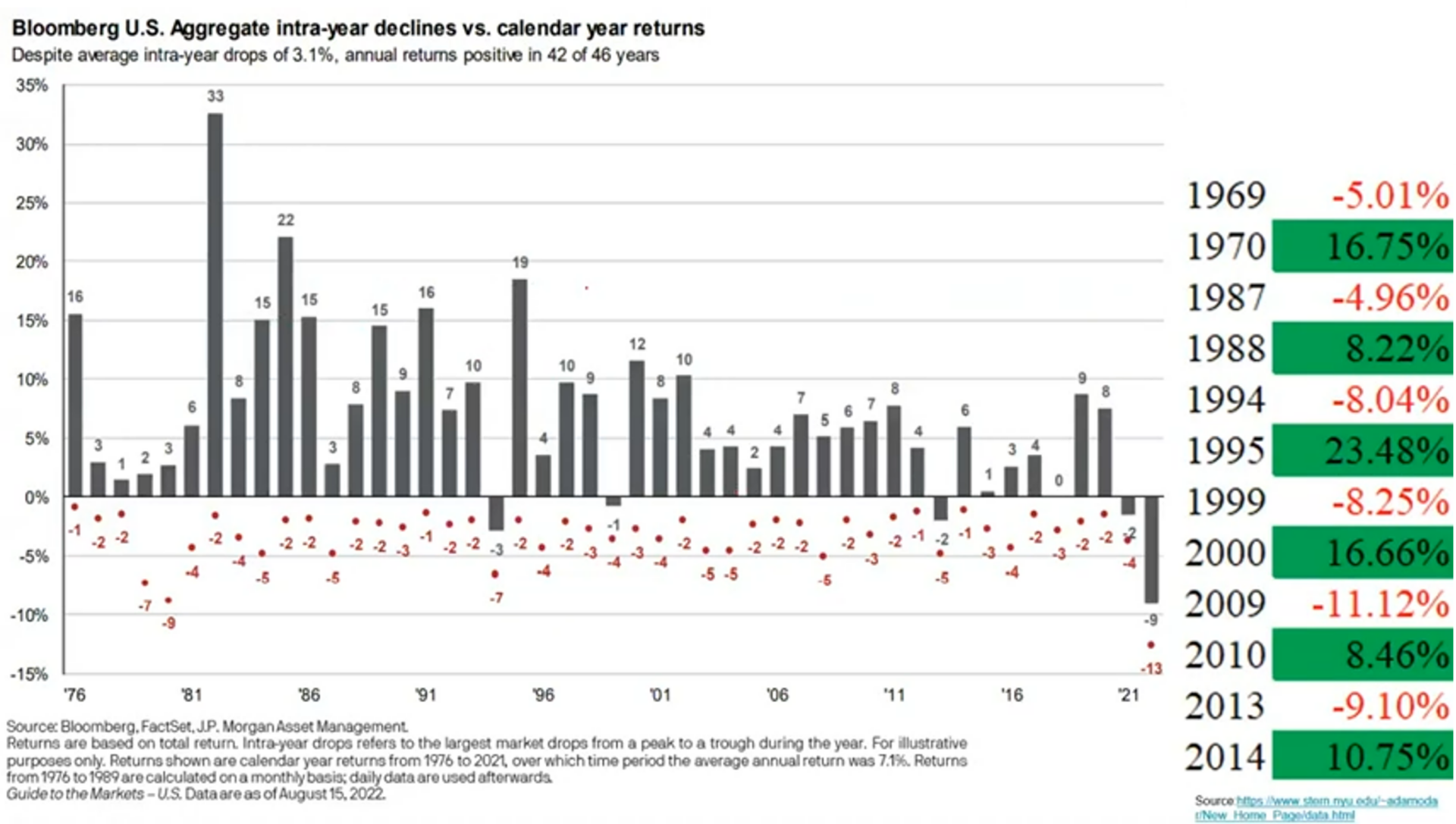
Continuing with the topic of bonds, over the last 12-18 months we have experienced one of the worst bond markets on record. As we examine historical bond returns, we point out the below table that highlights historical calendar years where 10-year government bonds were negative by around -5% or worse, and then highlight the calendar year immediately following. As shown in the below chart, the calendar year following a negative year for bonds has typically produced double digit returns. AllGen was underweight bonds going into this time period and has more recently been adding to bonds.
Stock Index Historical Performance
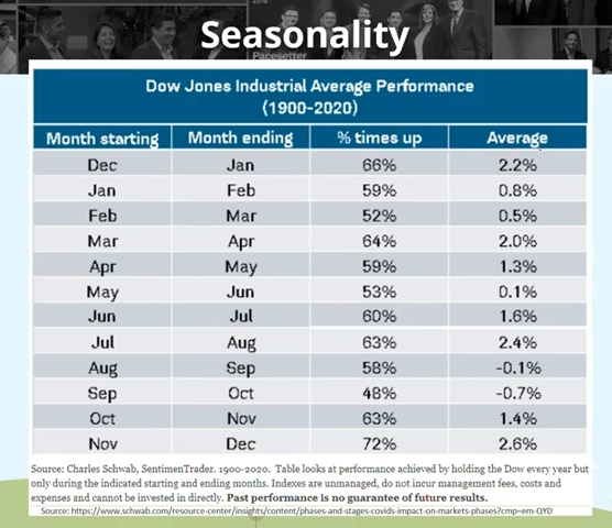
Seasonal historical performance can also offer economic insight. When examining stock index performance and averaging each month’s return since 1900 we can see that we are about to enter one of the weakest 2-month historical timeframes.
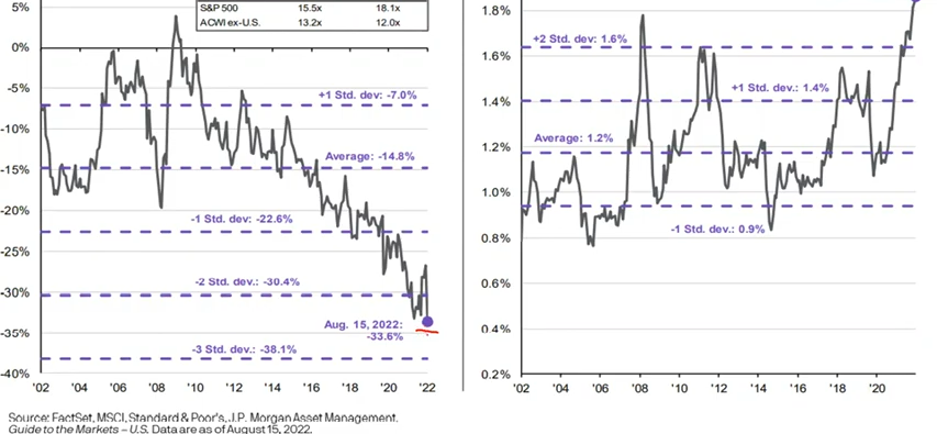
Briefly covering international stocks, we continue to monitor valuation opportunities within international stocks in relation to US stocks. The chart on the left in the illustration below indicates that when comparing P/E ratios of international stocks to US stocks, international stocks are trading at a 33.6% discount. This is by far the deepest discount in the last 20 years! Furthermore, international stocks pay a higher dividend on average than US stocks, also at its highest level in the last 20 years.
In closing, it’s important to understand current macroeconomic indicators and trends, and how actions of the Fed can influence the direction of economies. Understanding these relationships can help investors take advantage of opportunities in markets. Continuing to be mindful of diversification can also help investors reduce risk as different asset classes handle recessions differently. For additional information about how your investments at AllGen are doing, please contact your advisor here!
For more information, watch the full August 2022 Market Update video below.
Important Disclosures: The information provided here is of a general nature and is not intended to answer any individual’s financial questions. Do not rely on information presented herein to address your individual financial concerns. Your receipt of information from this material does not create a client relationship and the financial privileges inherent therein. If you have a financial question, you should consult an experienced financial advisor. Moreover, the hiring of a financial advisor is an important decision that should not be based solely upon blogs, articles, or advertisements. Before you hire a financial advisor, you should request information about the financial advisor’s qualifications and experiences. Past performance is no guarantee of future results. All expressions of opinion are subject to change without notice in reaction to shifting market conditions. Data contained herein from third party providers is obtained from what are considered reliable sources. However, its accuracy, completeness or reliability cannot be guaranteed. Examples provided are for illustrative (or “informational”) purposes only and not intended to be reflective of results you can expect to achieve. AllGen Financial Advisors, Inc. (AllGen) is an investment advisor registered with the SEC. AllGen does not provide personal financial advice via this material. The purpose of this material is limited to the dissemination of general information regarding the services offered by AllGen. The Disclosure Brochure, Form ADV Part II, which details business practices, services offered, and related fees of AllGen, is available upon request.

